


Tech
Apple Is Rebooting the Smart Home, and LG Is Bringing the Hardware
Read more


Back in 2020 I wrote A Guide to Segmented NPS for Consumer Products. To this day it's my most-read story on Medium, which tells you either how much people care about NPS or how little they care about my other posts. I choose to believe the first one.
That post was mostly about the why: an overall score only gives you a limited view, and connected products give you the data to see much more. This post is the how. You have NPS responses, you have device and app data, and you have maybe an hour on a Thursday afternoon. Where do you start?
NPS comes from one question: "How likely are you to recommend us to a friend or colleague?" answered on a 0 to 10 scale. Promoters score 9 or 10, passives 7 or 8, detractors 0 to 6. Your score is the percentage of promoters minus the percentage of detractors (Bain & Company). Bain also notes you can track it for customer segments, not just the whole company. That second part is the whole game.
An overall NPS is an average, and averages are very good at keeping secrets.
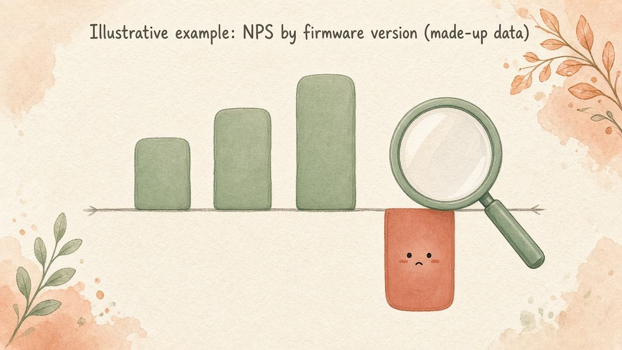
Say, for illustration (made-up numbers), your overall NPS is +32. Nobody panics. But when you split by firmware, most devices sit around +40 while the ones on version 4.2 are at -5. Those customers are not "fine." They're writing reviews. The healthy majority is just loud enough to drown them out.
That's NPS segmentation in one paragraph: stop asking "how are we doing?" and start asking "how are these people doing?"
Before you can cut anything, each NPS response needs to sit next to who answered it and what they're running. At minimum, join on a user ID:
A spreadsheet is enough to start. Fancy can come later.
For a connected product, here's the order I'd go in, roughly from "most likely to explain a sudden problem" to "most likely to explain a slow one":
One rule: one cut at a time. Resist the eight-way pivot table. It will look impressive and tell you nothing.
Finding a difference is easy. Finding a real one takes a little discipline.
A finding nobody acts on is just a very nice chart. Here's what I'd do once a gap shows up.
Close the loop with the detractors in that segment. Not a generic "sorry you're unhappy" email. Something specific: "We know some devices on 4.2 have had trouble with X. Here's what we're doing, and here's what helps in the meantime." As I wrote in the original post, a 0 and a 6 are not the same customer, so don't treat them the same. The 0 might need a human. The 6 might just need the fix.
Fix it, then re-measure the same cut. After the fix ships, survey the same segment again and compare against the same split. Keep a simple changelog of releases next to your NPS timeline so the next person (probably future you) can see cause and effect.
Turn promoters into reviewers. If you're wondering how to improve your NPS score where it shows up in public (reviews, not just dashboards), start here. Your happiest segments (say, active users on the latest firmware who use your best feature) are the right people to ask for a review. Asking everyone at once means asking your unhappiest segment too, which is a bold strategy.
Spread what your promoters love. If one feature shows up again and again among promoters, help other users discover it. Just remember that a correlation is a hint, not a proof. Nudge, then measure whether the nudged group actually gets happier.
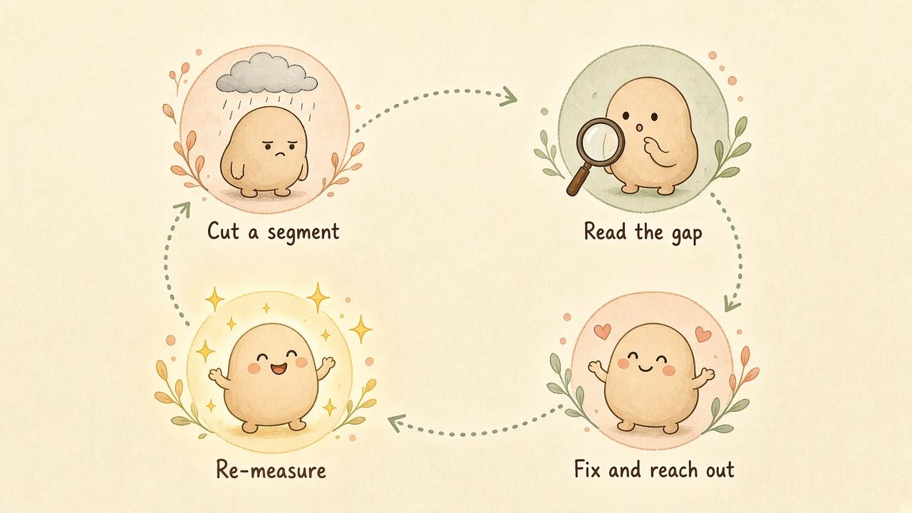
If you only have an hour this week:
That's it. No new tool required.
(If you'd rather not do the joining by hand, this is exactly why we built Segmented NPS at Copilot.cx. It brings together user, app, and device data so you can identify common characteristics among promoters and detractors. But a spreadsheet will absolutely get you started.)
Try one segment cut on your own NPS data this week. If you find something surprising, we'd love to hear about it.
Explore the latest news from the world of smart technology, with advice and inspiration to help optimize user engagement for your brand.


